VHX & Vimeo
VHX & Vimeo
Video analytics dashboard re-design
Project Overview
VHX, a subsidiary of Vimeo, is a digital distribution network that allows creators to sell their products directly through their site. VHX’s community of video content creators and sellers relies heavily on data and metrics provided on back-end dashboards to determine their product's success and inform business strategy.
Based on initial seller feedback they’ve received, VHX was seeking to update the current dashboard to allow sellers to view and visualize data pertaining to the viewing data of the viewing patterns of their audience.
Problem Statement
While the clients do use the current data they are given on the dashboard, it is not enough data to enable them to strategize their content. There is also data that is currently present in the VHX admin site that is too hidden, and therefore unused by the client.
Time span: 4 weeks Role: co-designer
Process
Research
Comparative and Competitive Research
To fully understand the areas of opportunity for VHX and to familiarize ourselves with video analytics, we performed a competitive analysis to further grasp the current video analytics landscape.
Key Findings :
Wistia and VHX incorporated the largest range of data into their dashboard, with Wistia placing a strong emphasis on customer journeys and viewing drop-off points. Wistia and Brightcove also placed a strong emphasis on incorporating the most extensive video analytics
Heuristic Analysis
We evaluated the current VHX dashboard using Abby’s Heuristics. Heuristics is a system of evaluation based on principles that analyze an interface from the perspective of the user.
We reaffirmed our initial problem statement and also found difficulty with the current Information Architecture, noting that the nomenclature used by VHX made it even more difficult for users to understand what was available throughout the site.
User Interviews
We were given access to top VHX sellers to gain a further understanding of pain points and areas of opportunity for the hosting site. Sellers we spoke with created and hosted content ranging from fitness to foreign film and everything in between. In our interviews, sellers confirmed many of our initial hypotheses but added further information about why the information is important to them and how they use the site.
Key findings:
Sellers felt that they couldn’t strategize content or create a marketing plan based on the information provided and lack of customer journeys. They also reiterated the lack of video metrics including top performing videos metadata tags to help organize their videos.
“We’re just throwing everything against the wall and hoping things sticks, but we need the daily data"
Persona
Putting all of our research together our team came up with a persona to develop our design ideas off of.
Feature Development
To ensure that we always kept both the persona and VHX’s needs in mind during feature prioritization we created an MVP, or Minimum Viable Product, to shape our designs and goals.
Our outlined MVP was to optimize the current dashboard in a way that users can clearly compare and analyze video and subscriber data/content. The data that users see on the dashboard will also be made available as an exportable file.
MSCW Method
We used the MSCW Method (Must Have, Should Have, Could Have, Won’t Have), to narrow down the potential features for the dashboard. Using a feature prioritization chart, we mapped out and prioritized based on efficiencies
We focused on the lower left quadrant, due to time and resource constraints. The additional features that were mapped out were still considered to be important to our users, and would be applied to the dashboard after additional research and planning could be conducted to plan a proper execution.
Design
Wireframes
We conducted a Design Studio to map out how to incorporate large sets of data into the main dashboard and bring hidden data out of content drawers.
With the large areas of unused real estate on the current main dashboard page, we add important data points highlighted from our user interviews, including video performance metrics and subscriber data. We also added additional data points to the Content and Customer page to help create customer journeys.
User Tests
Performed two rounds of user tests with 10 participants on our medium fidelity screens. We walked our testers through the prototype and asked them to perform a set of tasks as our STYRCHA employee, noting where users were unable to complete tasks or were confused based off of wording or options available.
Information Architecture
During heuristic analysis, user interviews, and testing, we found that the current navigation was confusing users and hiding important information. To clearly identify what each tab contained and where information could be found, we renamed tabs and removed drop-down menus.
Site Maps
With the new Information Architecture developed, we created a new site map. Our proposed sitemap included reflected updated terms and the reorganization of data points throughout the dashboard site.
Prototype
Main Dashboard
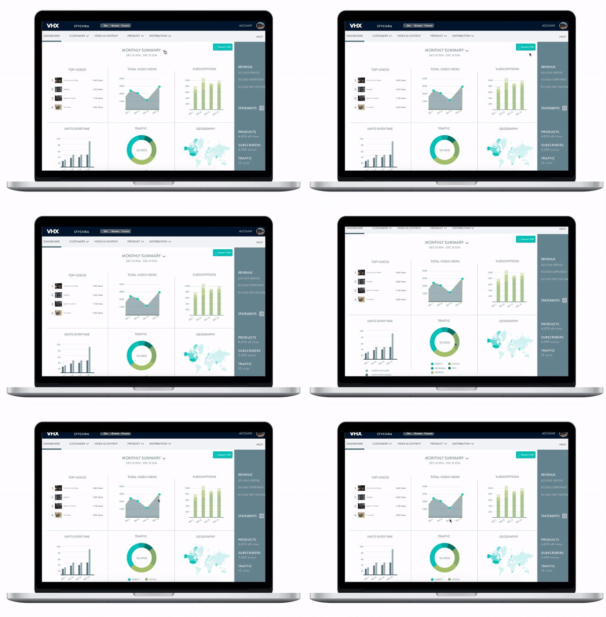
We utilized the available real estate to add a comparative birds eye view. We added video analytics to provide a richer performance snapshot. Actionable graphs allow sellers to quickly hover over data points to gauge performance.
Comparative Page
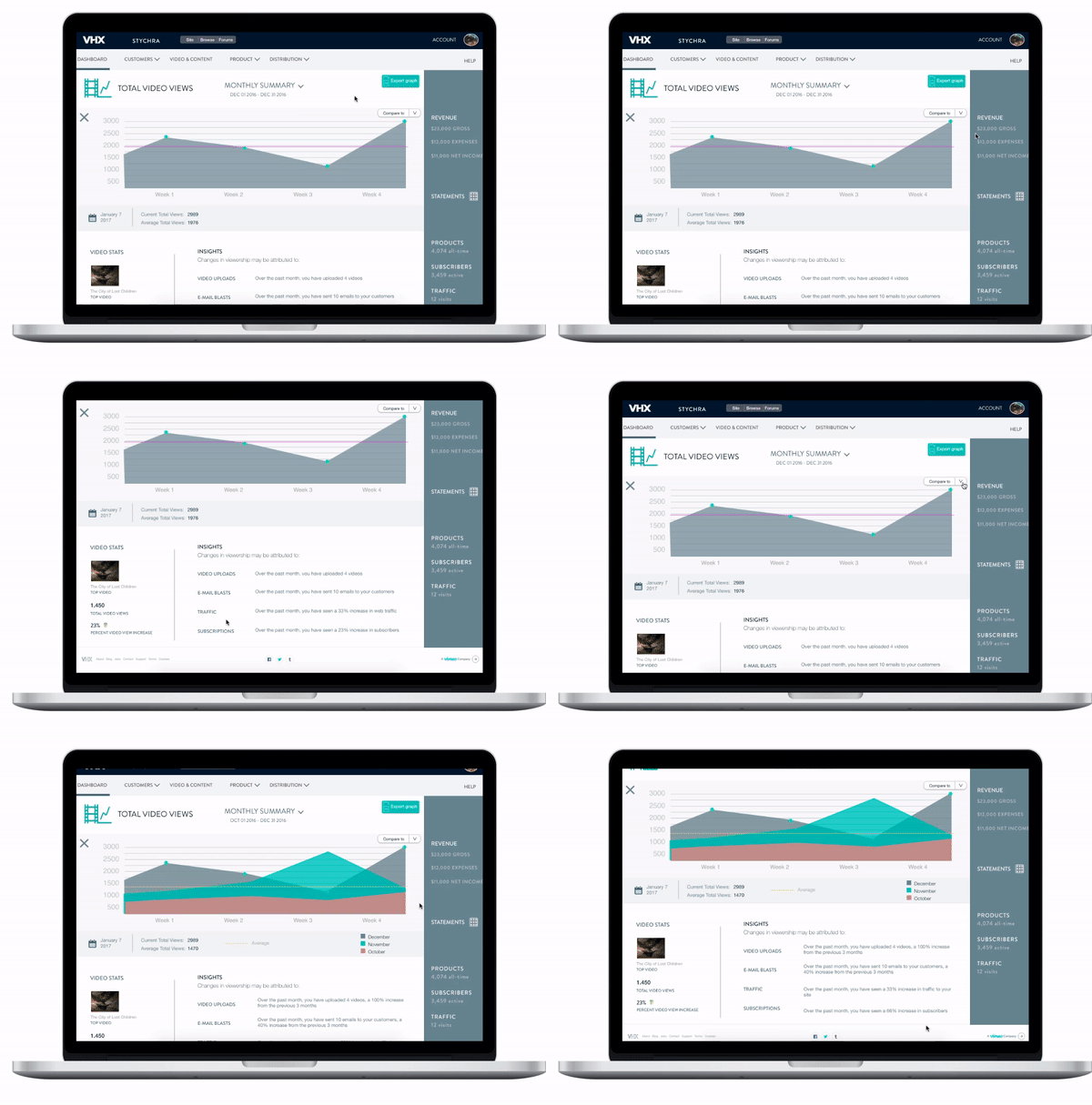
Based on user interviews, we created a new feature on the dashboard, which allows sellers to compare data performance over different periods.
We also included insights at the bottom of the page, which include emails sent, web traffic, and subscriber changes to help sellers determine why their products have performed well or poorly over a period of time.
Content Page
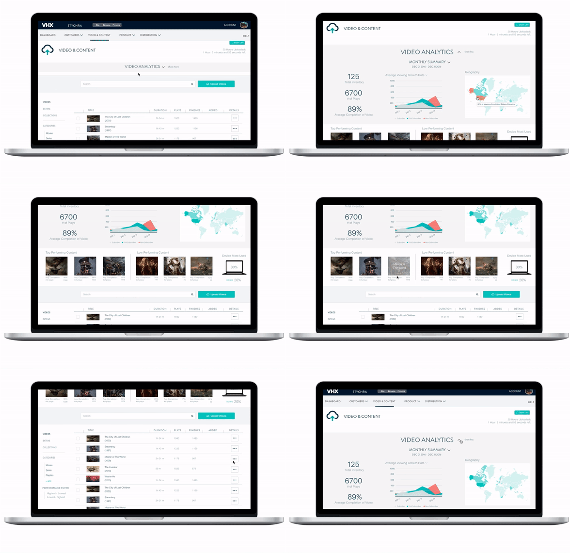
Included video analytics on the content page to allow sellers to see video performance stats near their content library. We also pulled viewing stats out of the drawer and onto the main page, including the highest and lowest-performing videos
Content Drawer
Added metadata and tags to the individual content drawer to allow sellers to organize their content and appear in search engines. We also moved the "Stats" tab to the forefront of the page to give it priority, and included individual video viewing performance over time to help identify trends.
Customer Page
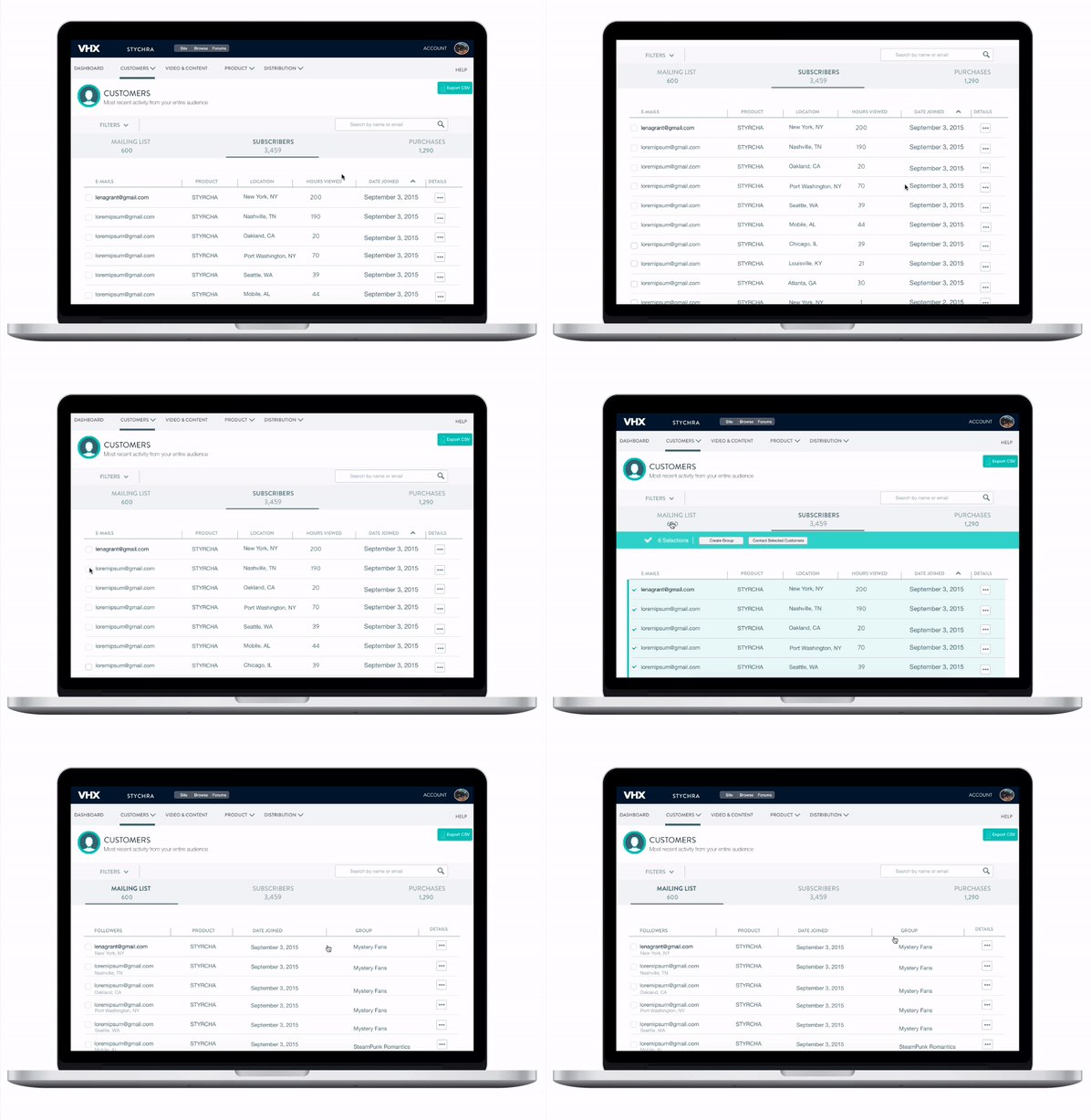
Based on the I.A. updates and heuristic analysis, we renamed "Followers" to "Mailing List" as the previous nomenclature did not clearly define what a follower is, and added it as a tab to the customer page instead of a dropdown menu item. To help with marketing and promotion capabilities, we added the ability to create groups. Sellers could contact groups to push promotions based of geo-location, viewing patterns, or other criteria.
Customer Page Drawer
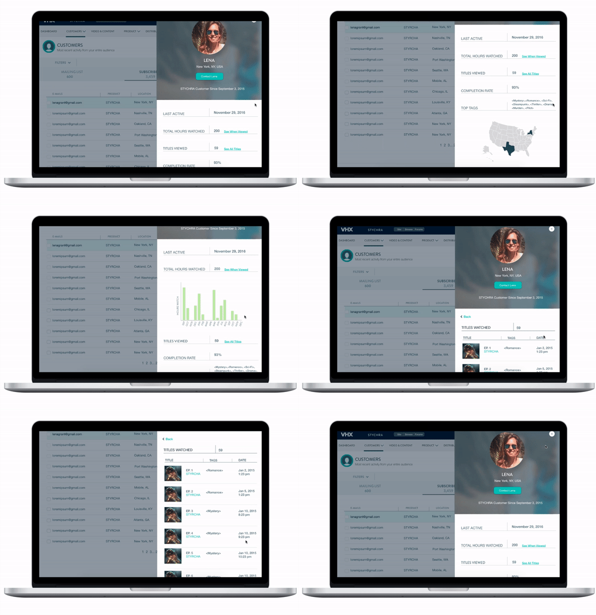
Added viewing data to customer drawers to determine user behavior and help create a journey to the customer page. Data included video tags, hours viewed, and titles watched. This information could be used by sellers for marketing and created customer groups based off of interests.


